GoTo Inbox
A multi-channel messaging platform for small businesses to manage SMS, email, and web chat conversations as a team.
- Duration
- June 2022 – March 2024
- My role
- Lead product designer
- Platform
- Web
The opportunity
GoTo identified a market opportunity: a communication tool designed to help small teams (5–10 people) manage their external business communications together.
What I designed
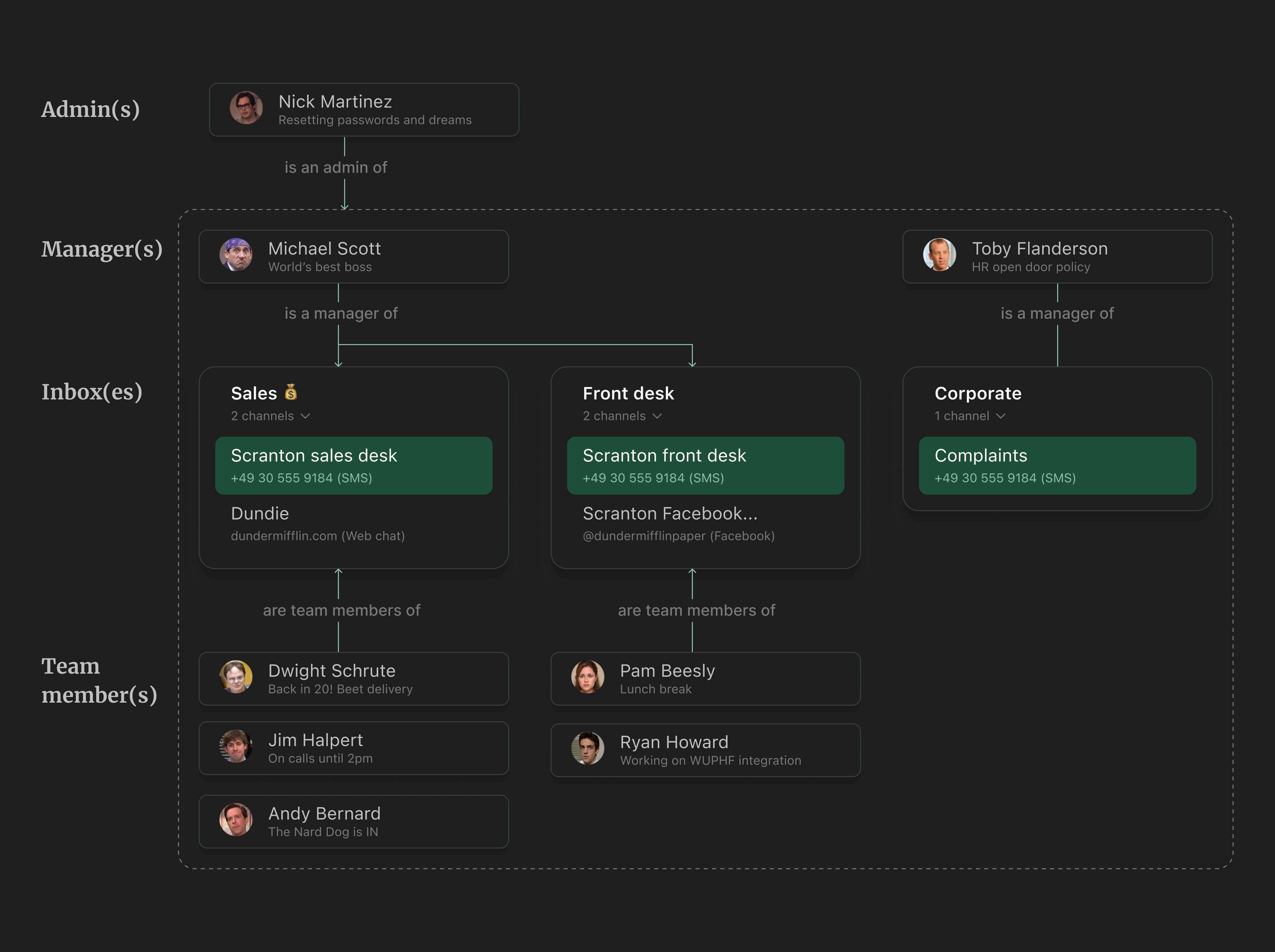
GoTo Inbox let small businesses create shared inboxes, each supporting multiple customer-facing channels like SMS, email, and web chat. Team members could collaborate on incoming conversations, with managers overseeing the workload. Above it all sat an admin who controlled access, created inboxes, and purchased additional capabilities.
My design process: Insight ➔ Object ➔ Sketch ➔ UI
I'm a huge fan of Sophia Prater's OOUX methodology since 2018. The Inbox project was the perfect environment to work with OOUX because it was partially a blank canvas.
Here's a breakdown of the process:
Talking to customers and stakeholders
The interesting part
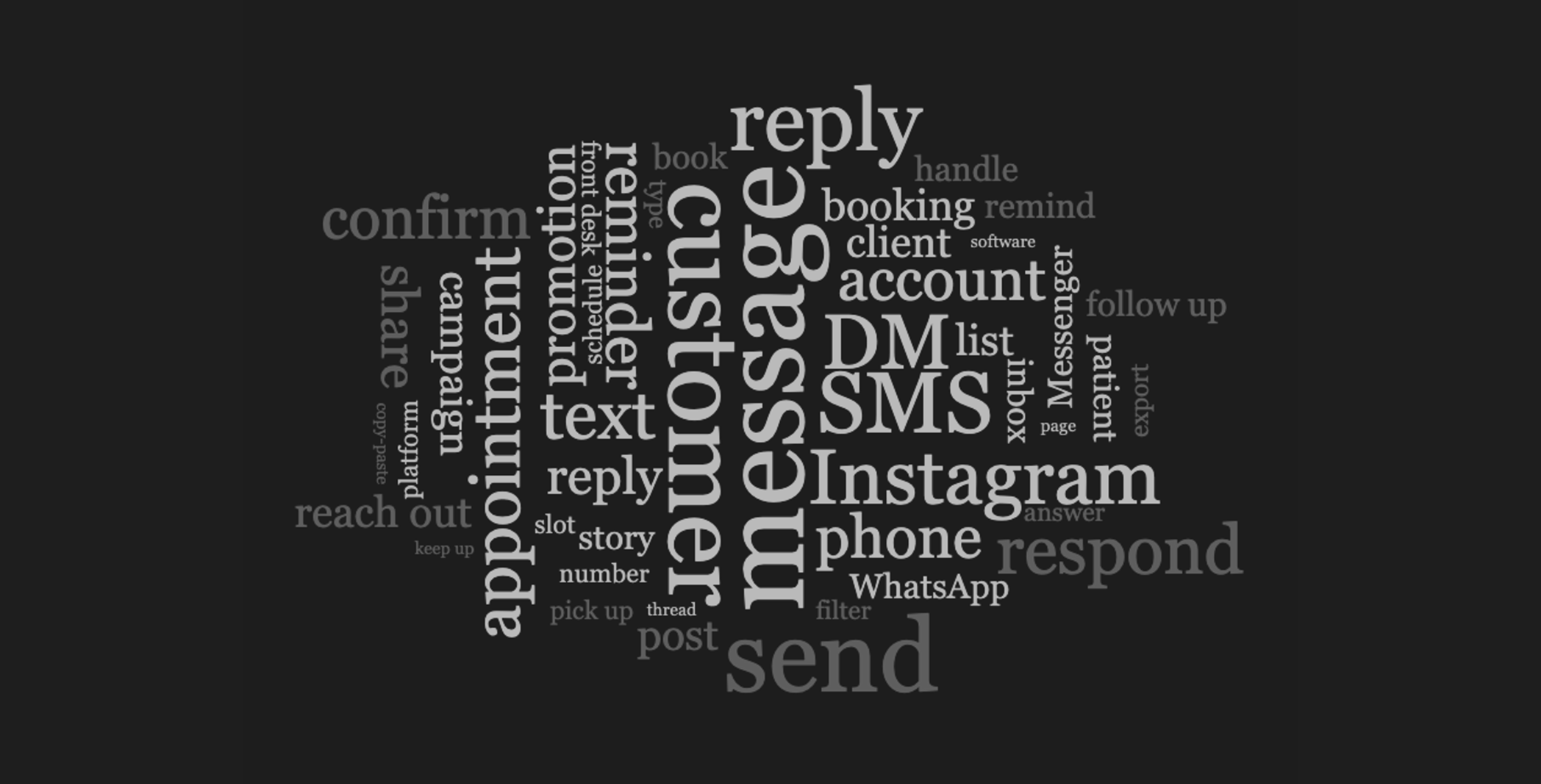
Designing with OOUX begins by understanding our customers' mental model of messaging in the context of their business. We had an aggressive initial deadline to come up with a concept, but luckily there was a good amount of existing research: recordings and studies of people talking about messaging and their business. Beyond pain points, goals, and needs, I was looking to learn about the nouns, verbs, and adjectives they use to describe their experiences.
Talking to stakeholders was almost equally important. I needed to understand how the business talks about the problem and solution space. In the case of Inbox, even though we were working on a new product, the business already had a lot of preconceptions. We had, after all, several full-fledged messaging products. I threw everything into a word cloud, and below you can see the results.
Modeling experience objects
The hard part
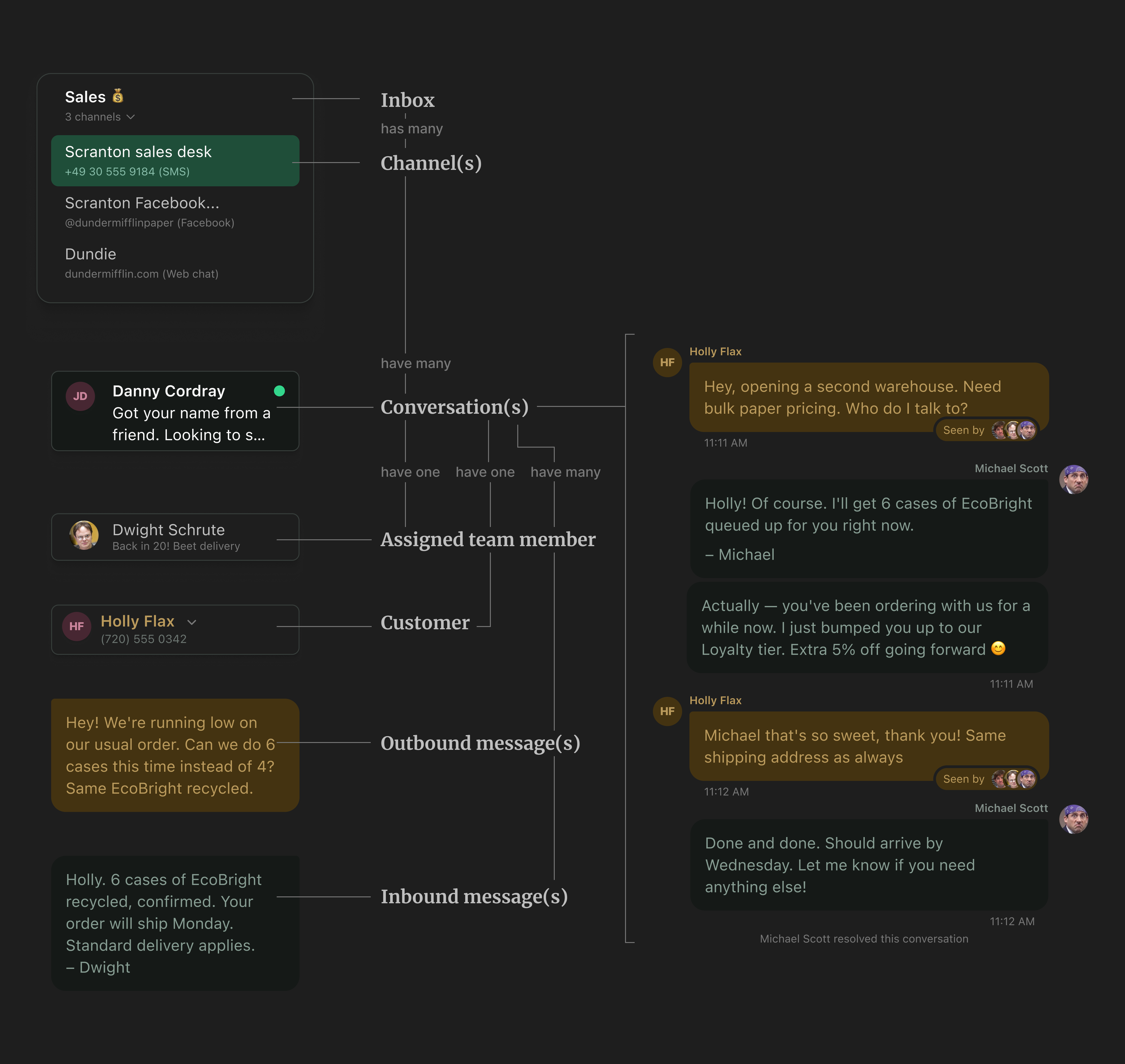
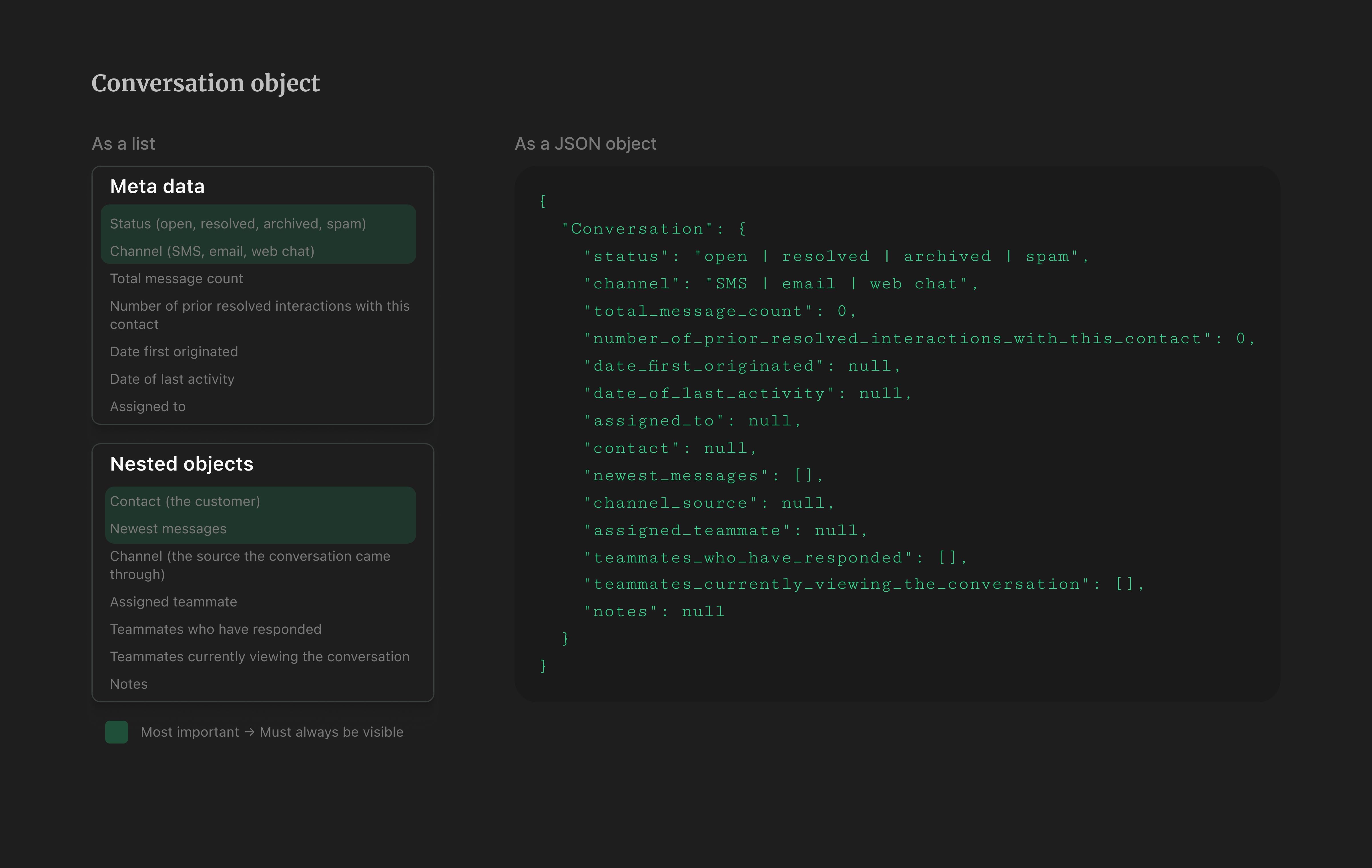
After building a good collection of words from the user's world, I created object maps where I documented definitions, properties, metadata, and nested objects. This is the hardest part of design. I made these mostly by myself but had them reviewed by my trio partners. Addressing as much ambiguity as possible at this stage makes the rest of the process much easier. The image below shows an example of a conversation object.
💡 In hindisght: If I could do this project again, I would turn those lists into JSON objects and involve the backend devs working on this. That would have ensured a much tighter alignment, saving me hours of rework and saving my dev friends many unwanted surprises. Requests like "Hey, can you add a timestamp here?" might seem small on a mockup but can be very difficult to pull off on the backend.
Sketching solutions
The fun part
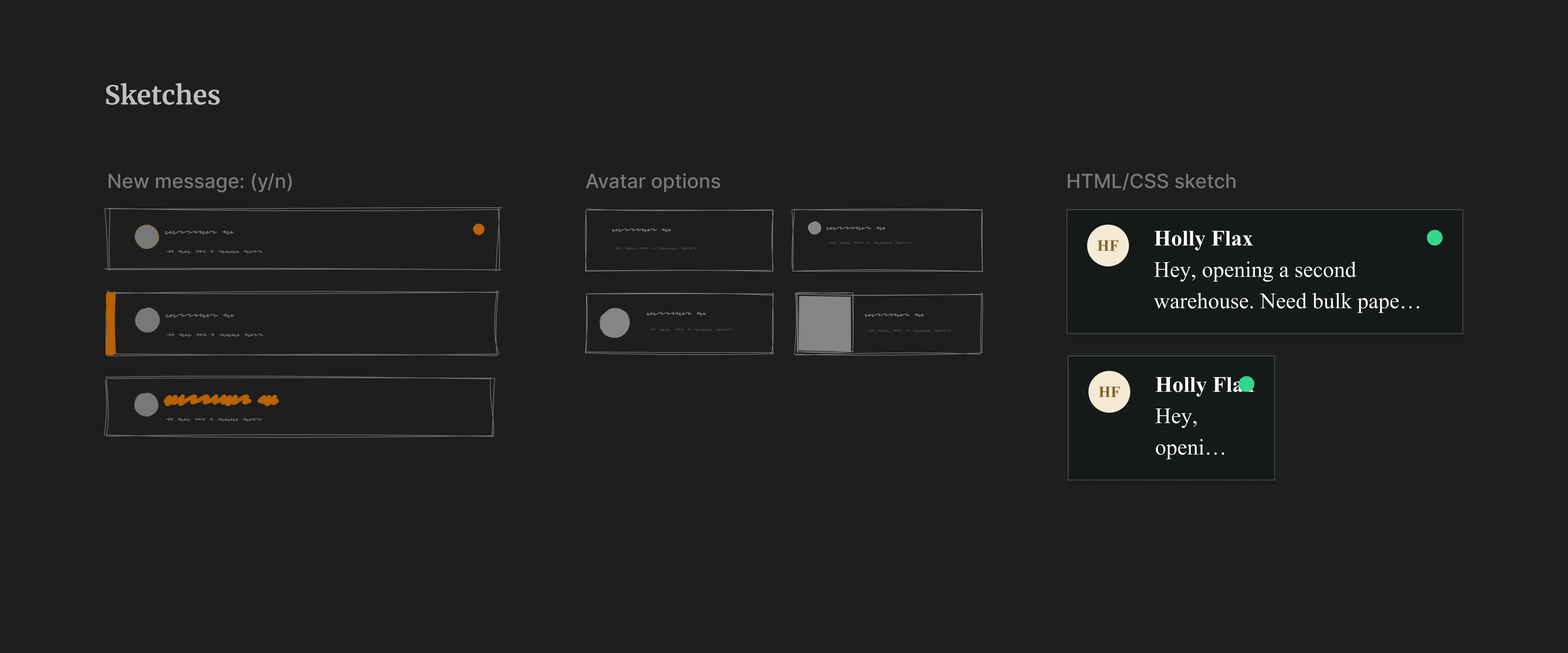
Once objects and their definitions have been loosely defined (though the tighter the better), I can begin sketching representations of each object or property. In this example, I'm sketching ideas for representing the "new message" status and exploring ways to show avatars for unknown users. Sketching and ideating within the bounds of an object definition removes a lot of the stress from this part of the design process.
At this stage, I also create quick proofs of concept with a bit of HTML and CSS. Over the years, I've learned that many design questions are best answered in the browser.
Flair pass
The statisfying part
After experimenting with sketches and object definitions, I transfer the ideas into polished UIs. At GoTo, some times the sketching and the high definition passes can look very similar because we have a very complete design system.
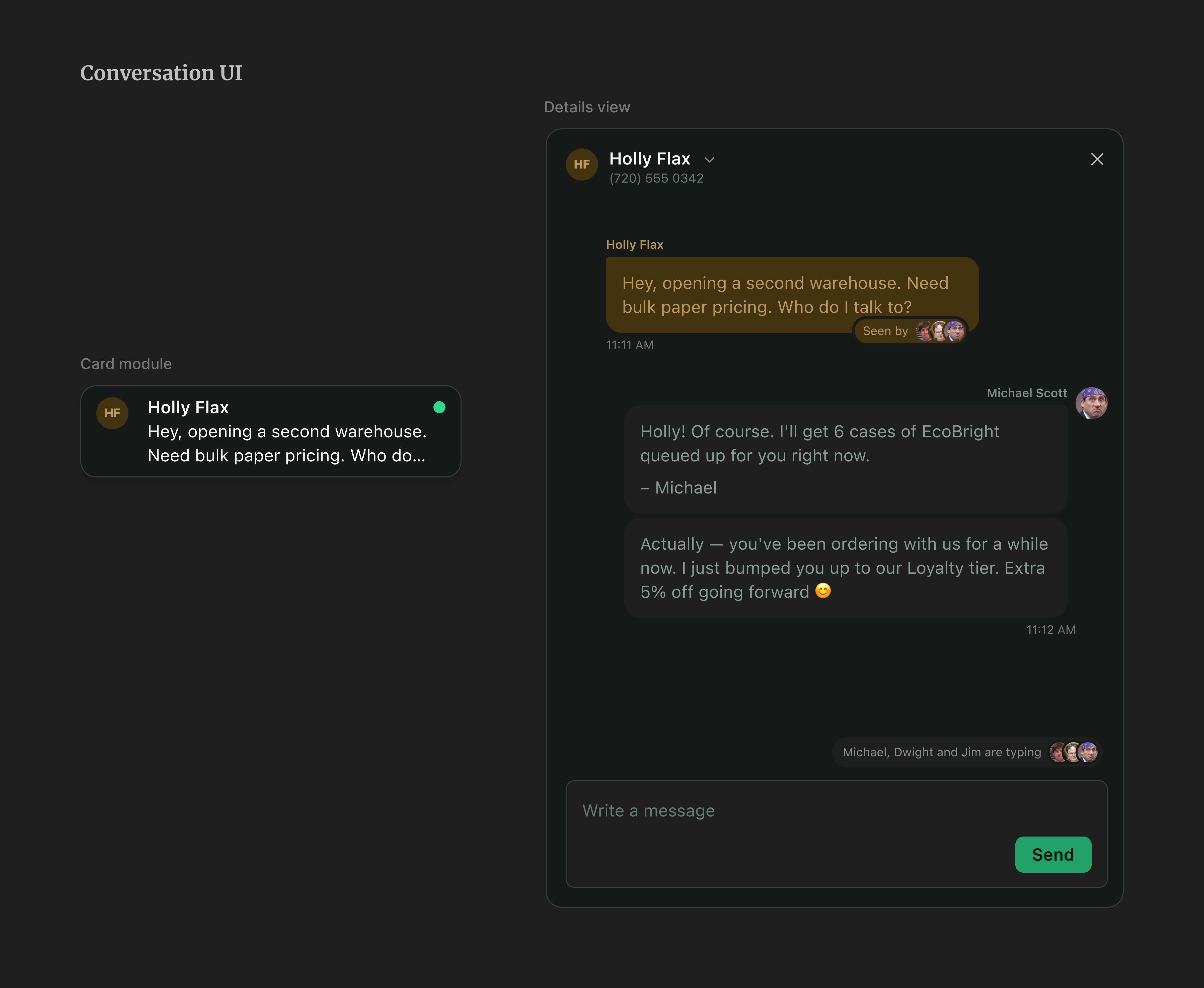
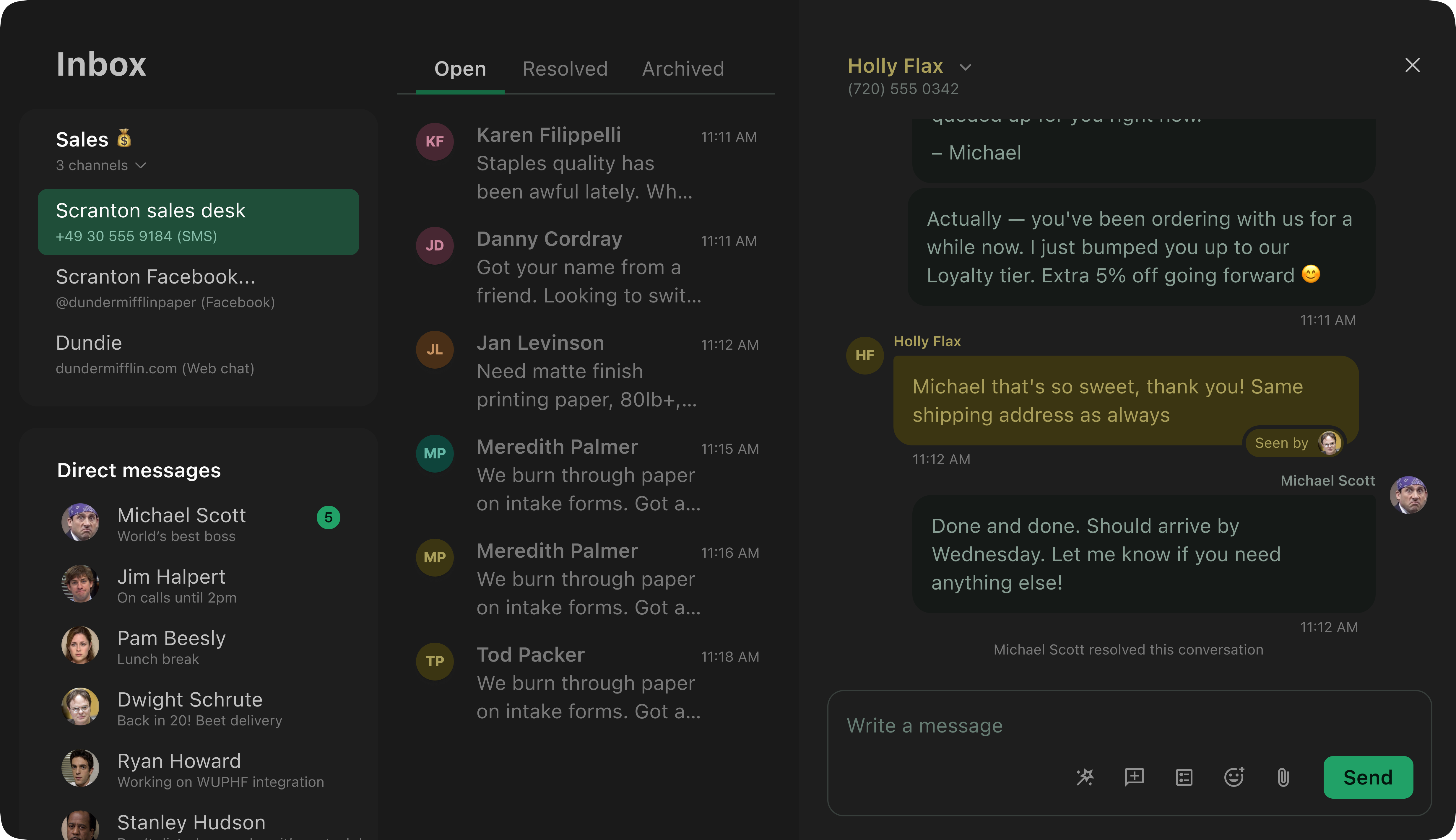
The conversation flow
Once the objects and their modules (their UI representations) are ready, creating flows becomes straightforward. I want to emphasize that the hardest and most cognitively exhausting work happens at the object definition stage. There's always some back and forth, and object definitions are always evolving, but if the definition is mostly solid, building an interface and an experience on top is a very smooth process.
The core of Inbox is a shared conversation view where managers and team members can see and interact with all customer conversations as a team. I designed features that let people observe their teammates interacting with customers in real time. We also inherited an annotation system from another GoTo product, Customer Center, where team members can mark a conversation as resolved and add notes about the interaction.
Core tasks and continuous research
To keep our priorities clear and ensure that adding features never compromised the fundamentals, I proposed a Core Tasks study measuring ease, efficiency, and satisfaction across eight tasks that represent the most essential things someone needs to do in Inbox. The primary goal was a baseline we could return to: as the product grew, we needed to know the core flows weren't being eroded.
- Identify new messages
- Find or open a specific message
- Assign a conversation
- Respond to a conversation
- Know when colleagues need support
- Comply with opt-outs
- Register a new number
- Save new contacts
We ran two rounds: Round 1 (February 2023) with 21 participants and Round 2 (June 2023) with 18. I commissioned each study, reviewed the research proposal, built the prototypes used in the sessions, and attended every interview as a note-taker. The researcher wrote the final script, recruited participants, ran the interviews, and wrote and presented the findings report.
| Task | Feb 2023 (n=21) | Jun 2023 (n=18) |
|---|---|---|
| Identify new messages | 93.7 | 97.0 |
| Open a message | 85.2 | 88.9 |
| Assign a conversation | 42.2 | 78.0 |
| Respond to a conversation | 81.9 | 93.1 |
| Know when colleagues need support | 34.2 | 63.4 |
| Comply with opt-outs | 16.8 | 63.9 |
| Register a new number | 7.5 | 65.6 |
| Save new contacts | 16.8 | 23.9 |
Conclusion and reflections
Over several months, we made meaningful progress across the core flows and held the line on others despite a growing feature load. Saving contacts was the hardest sticking point: improving it required backend changes that were too expensive to justify, and leadership wasn't ready to commit until the product had demonstrated more traction.
I worked as lead designer on this project for nearly two years. It was the strongest trio collaboration I'd experienced: the PM, engineering manager, and I were aligned on how we wanted to work together. The conditions weren't always perfect and the work was sometimes messy, but we acknowledged that and kept moving. It proved to me that great product design is truly a team sport.
Final impact
- Business accounts serviced
- 200+
- Messages sent per month
- 500k+
- NPS average improvement (from 5.0 to 6.3)
- +1.63