Mobile Component Library
Extending a web design system to iOS and Android by building a React Native component library from the ground up.
- Duration
- May 2024 – August 2025
- My role
- Design systems lead (mobile)
- Platform
- iOS, Android (React Native)
Context
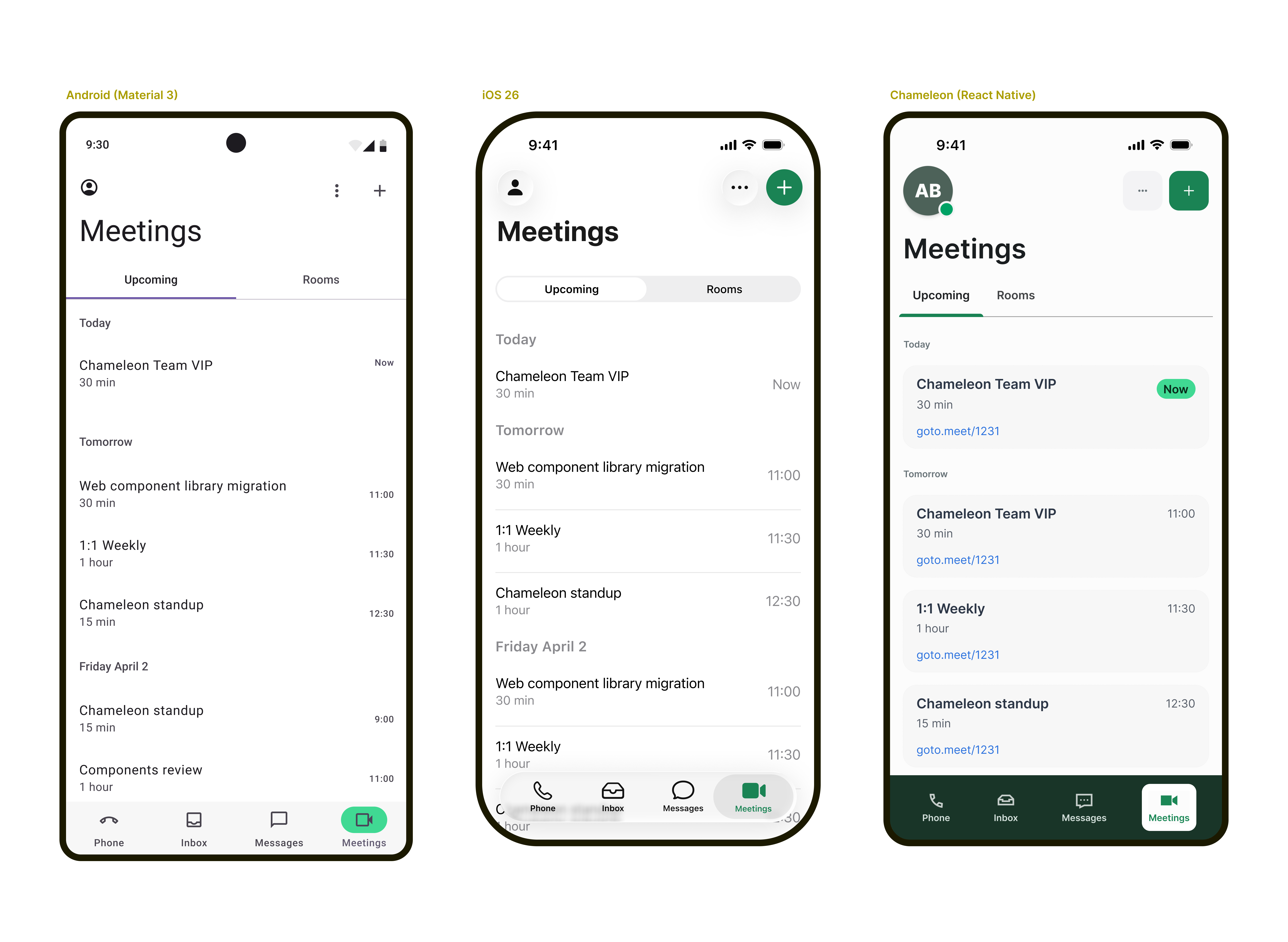
GoTo's design system, Chameleon, had a stable web foundation: roughly 60 components, solid documentation, and growing adoption. Mobile was a different story. There was no shared component library, so every feature meant building UI from scratch. Our highest-ROI opportunity was clear: extend Chameleon to mobile using React Native, which would speed up feature delivery and open mobile development to any engineer working with JavaScript.
My role
I was assigned as the design systems representative on the project, responsible for leading the design effort and ensuring the mobile library remained consistent with Chameleon's existing foundations. I collaborated with mobile designers from another team, the React Native engineering squad, and stakeholders across design and engineering leadership.
The core challenge
The project surfaced a fundamental question early on: should the mobile components replicate the existing web library, or should they be redesigned to follow native mobile conventions?
The mobile design team viewed this project as an opportunity to improve the mobile experience and align it with native platform expectations. The design systems team's mandate was to maintain consistency with the existing library. Both perspectives had merit, but they pulled in opposite directions, and a clear resolution from leadership did not arrive early enough to prevent ongoing friction.
Breaking the impasse: component triage
After completing the first batch of components, which were relatively straightforward, a clear gap in goals and priorities between the two teams became harder to ignore. Rather than treating it as a general disagreement, I identified specific examples: components where translating from web to mobile was uncontroversial, and others where it was genuinely contentious. By separating these into distinct lists, the team could continue shipping work on the components everyone agreed on while leadership worked toward a resolution on the rest.
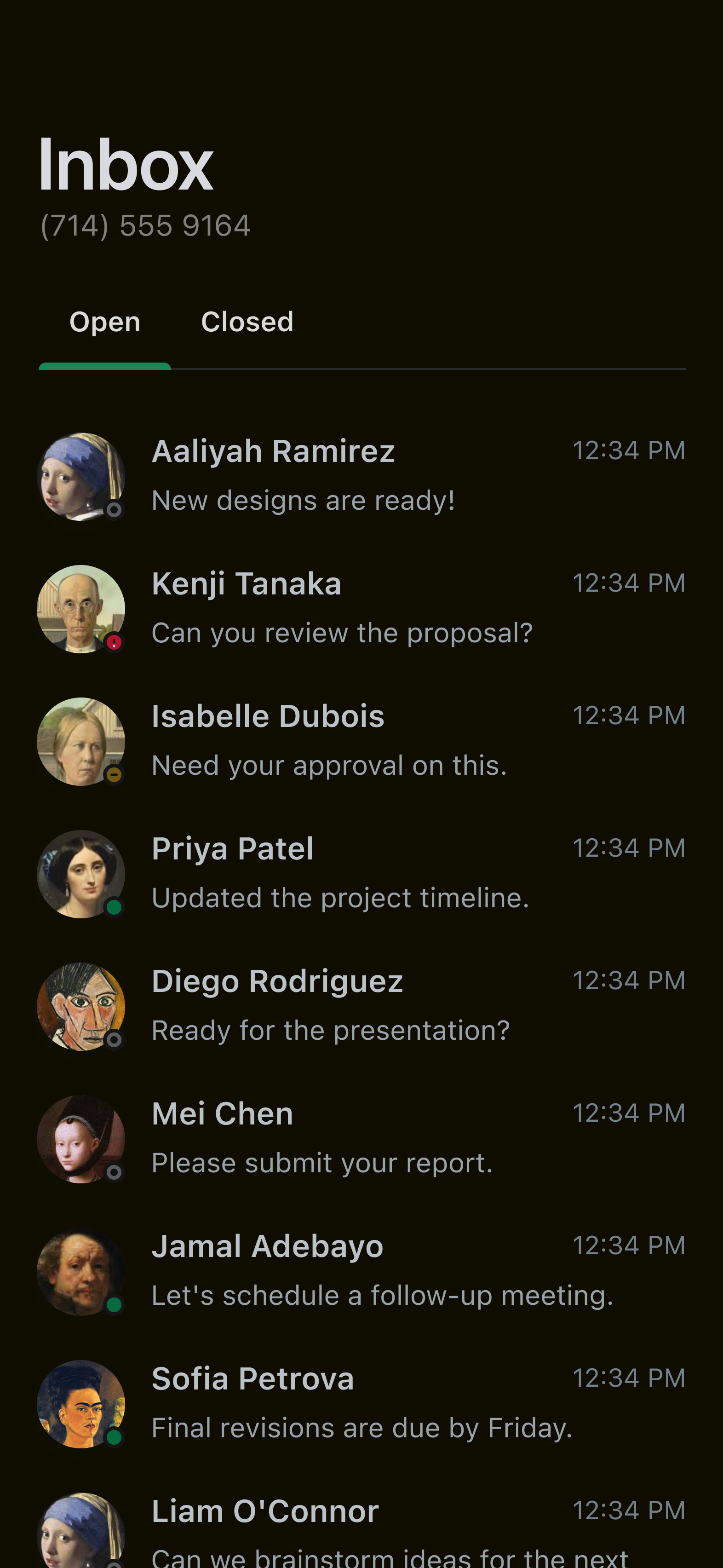
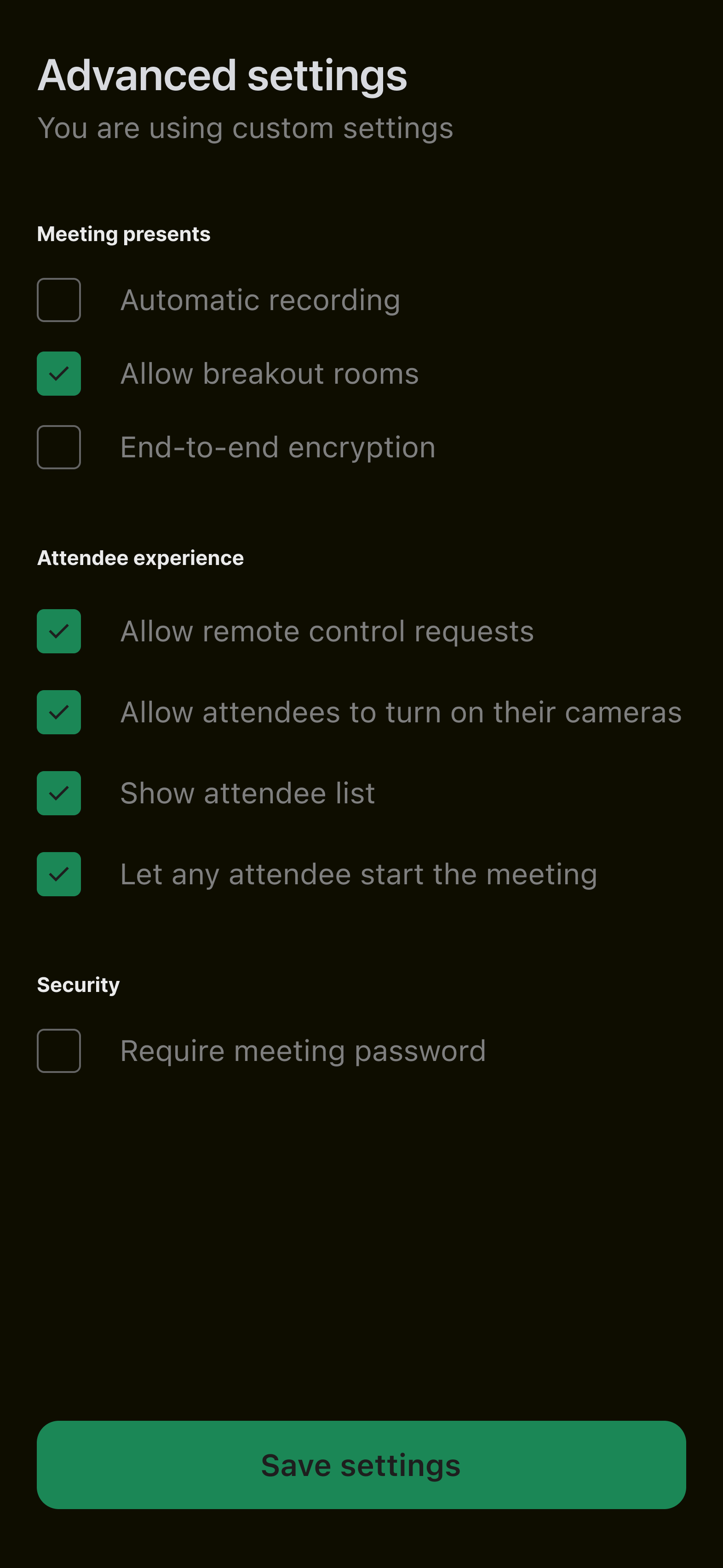
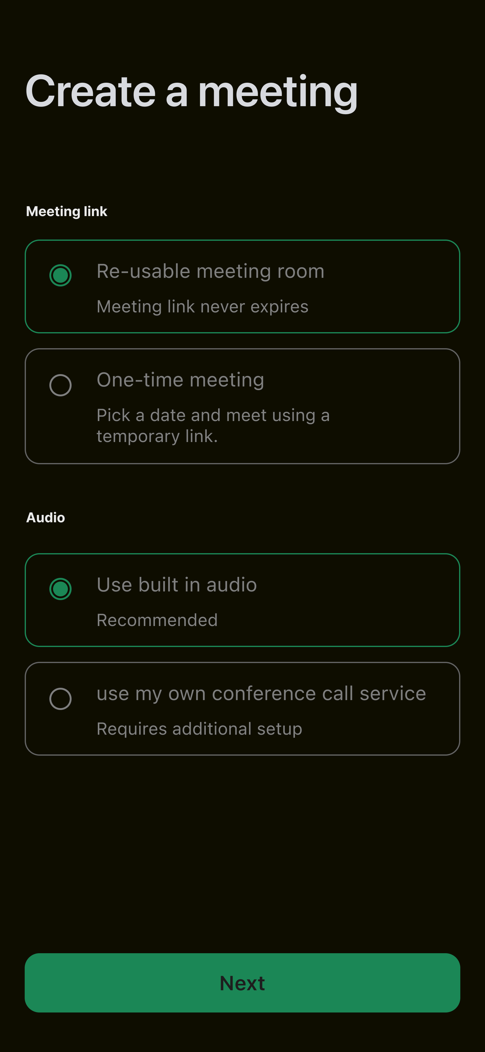
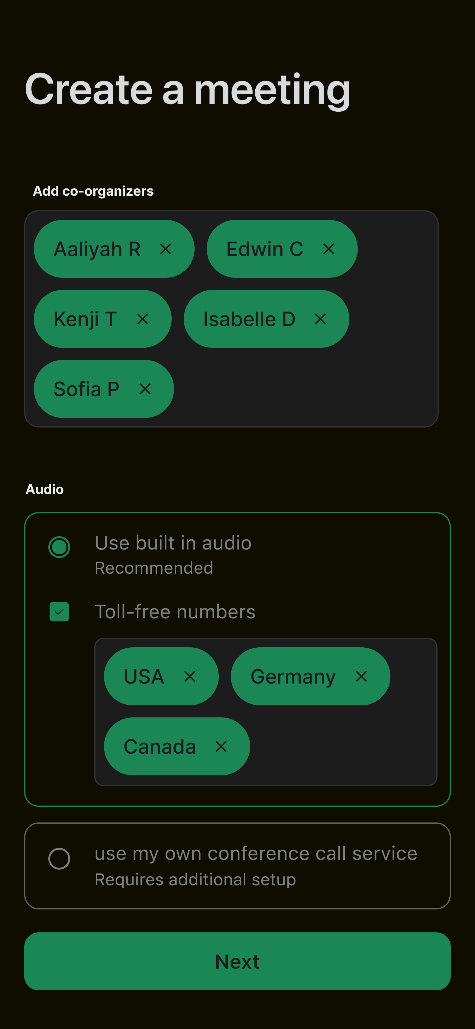
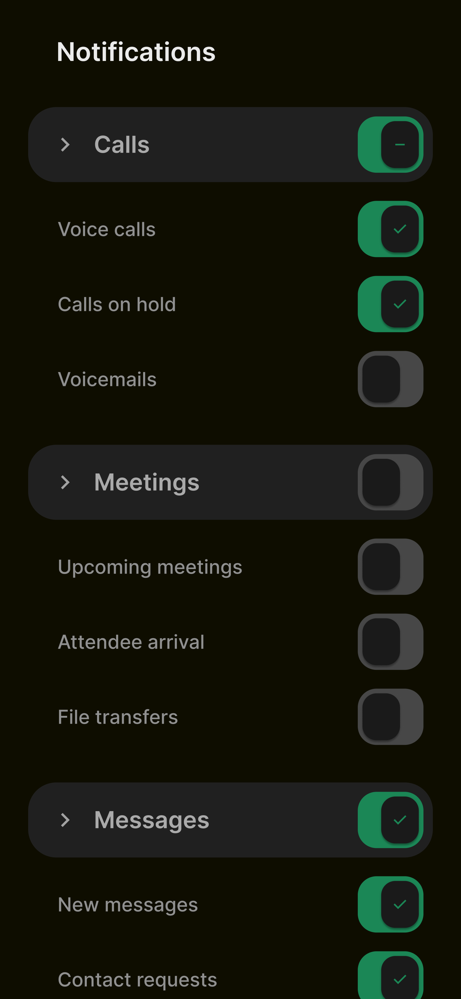
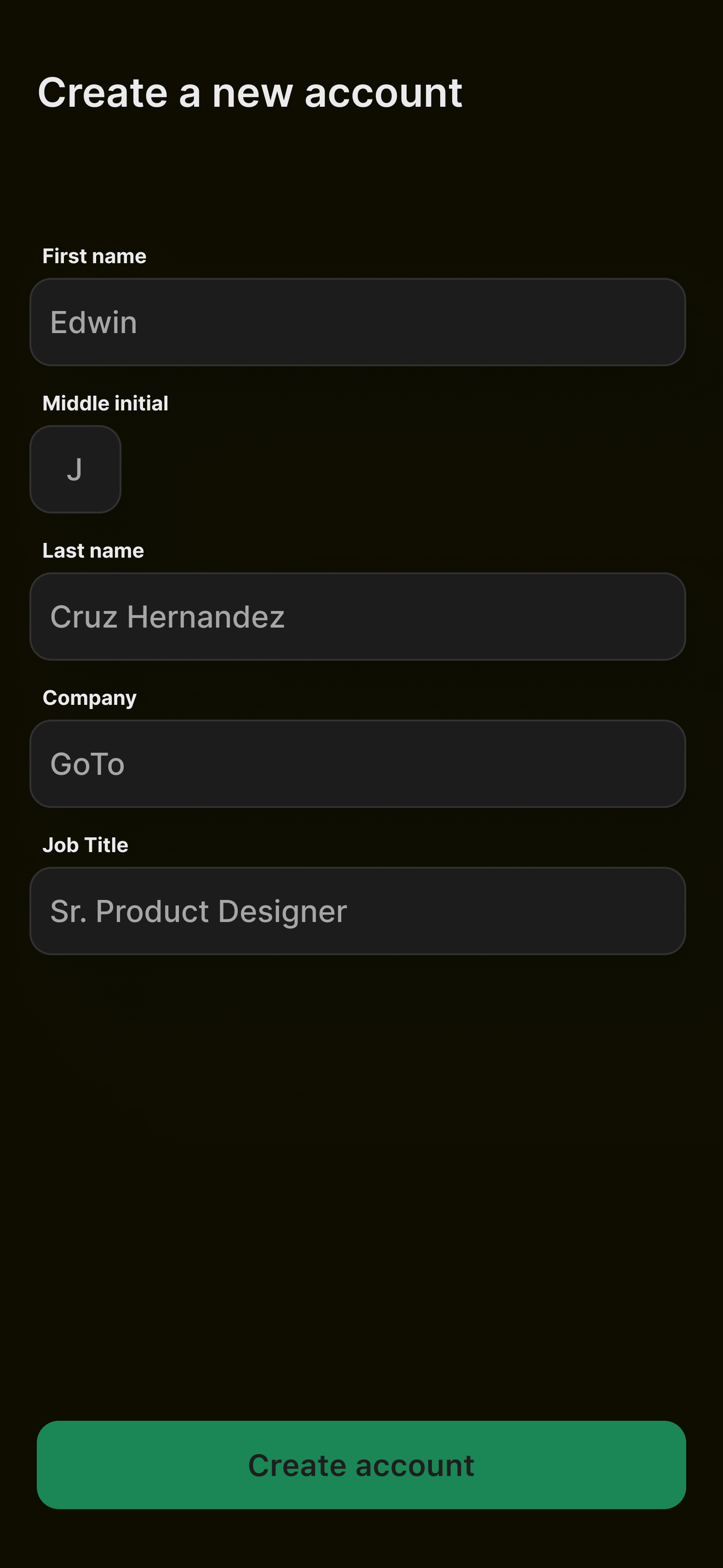
- Shared components (~20): Components both teams agreed could transfer to mobile with little to no modification. These became the immediate focus.
- Mobile-specific components (~20): Components like bottom sheets, navigation tabs, title bars, long-press menus, and share sheets that both teams agreed would naturally differ on mobile. These were deferred for a later phase.
- Disputed components: Components where platform conventions diverged significantly and neither team could agree on the right approach. These were parked until leadership could provide direction.
This triage allowed the project to move forward on the components with clear consensus, rather than remaining blocked by the ones that required a strategic decision.
Coded prototypes as a communication tool
Early reviews in Figma tended to stall. Static screens invited overanalysis, and feedback often focused on pixel-level visual details rather than how a component would actually feel in use.
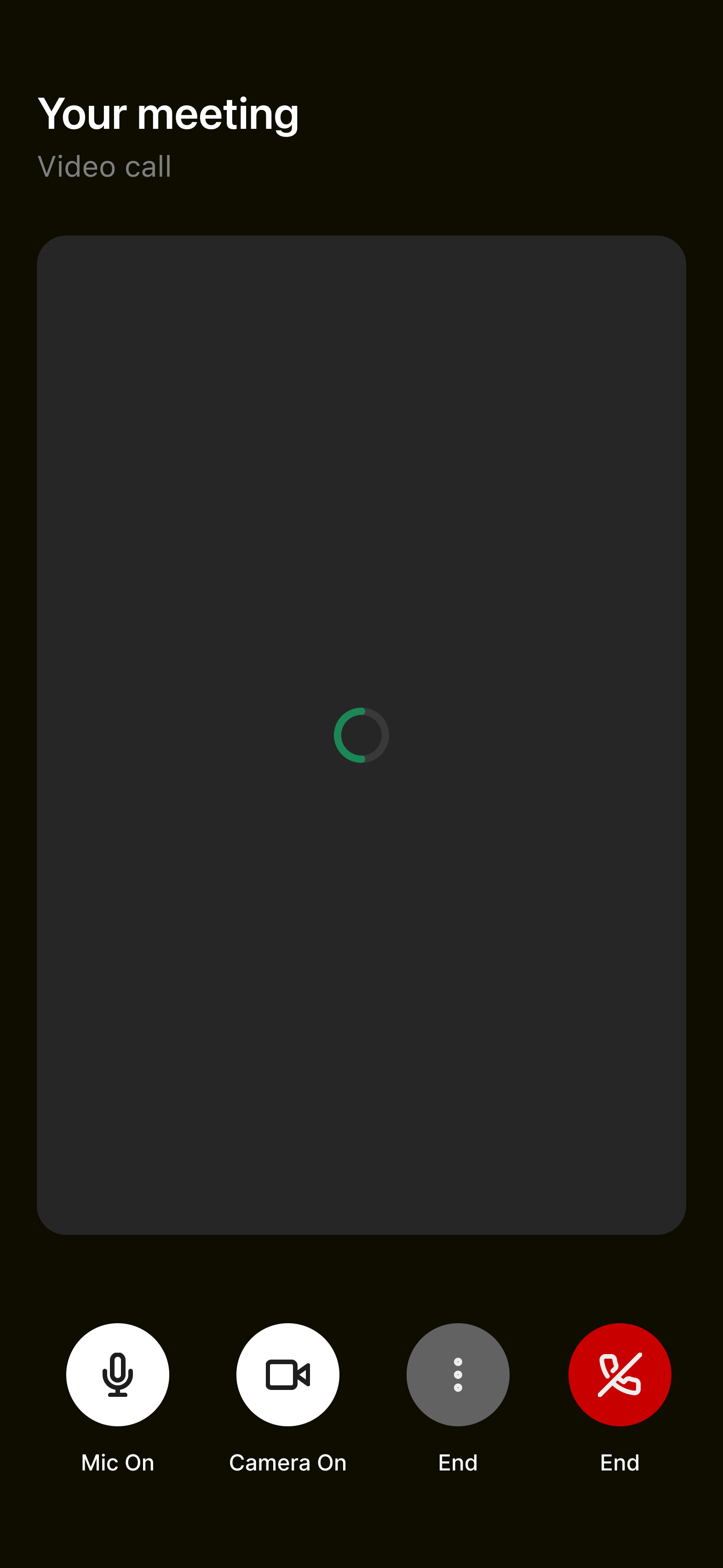
To move past this, I started building interactive prototypes using an online IDE and sharing them as links. This was especially valuable because the team was distributed across Central Europe and Montreal, so asynchronous, hands-on review mattered more than a live walkthrough. Collaborators could open a link on their phone and interact with a component on their own time. These weren't React Native prototypes, but after consulting with our engineers, they confirmed it was still useful to see the design intent: the component structure, styling, and motion behavior came through clearly enough to ground the conversation. The mobile designers responded positively, and components they had pushed back on in Figma felt much more acceptable when experienced in context.
This approach was eventually discontinued due to internal security policies around the link-sharing mechanism. The team reverted to reviewing screen recordings shared over messaging, which lost the immediacy and interactivity that had made the prototypes effective.
Mobile accessibility
One of the most valuable outcomes of the project was the team's investment in mobile accessibility. This was new territory: Chameleon's web components had well-documented accessibility guidelines, but mobile introduced a different set of requirements and testing workflows.
I researched how assistive technologies interact with components on both iOS (VoiceOver) and Android (TalkBack), and documented the expected behavior for each component in the library. The team established a hands-on testing practice, using VoiceOver on iOS devices and TalkBack on a company-provided Android phone to verify that every component worked correctly with screen readers.
The project also addressed dynamic type (iOS) and its Android equivalent, ensuring that components could scale appropriately when users adjusted their system font size for accessibility. This capability had never been part of the design system before and required new design guidelines and engineering patterns.
The adoption bottleneck
An unexpected challenge emerged on the engineering side. While creating new components in React Native was achievable, replacing existing component instances in live applications proved far more difficult. Each replacement required code reviews and approvals from the mobile codebase owners, the same overloaded developers the project was designed to help.
This created a situation where design was, for the first time, significantly ahead of development. The components were ready to use, but the path to production was gated by the availability and capacity of mobile platform engineers who were managing competing priorities.
Outcomes
The project was paused after roughly a year to allow the team to address other priorities, with a plan to resume in the following cycle. At the time of pausing:
- 20 components delivered: Designed, built, documented, and available in the React Native codebase. These covered the components both teams agreed could be shared across platforms with minimal modification.
- Mobile accessibility framework: The team established practices for documenting and testing accessibility on both iOS and Android, including VoiceOver, TalkBack, and dynamic type support. This was a new organizational capability.
- Production pipeline: A repeatable workflow for designing, developing, reviewing, and releasing mobile components, matching the standards of the existing web pipeline.
- Component triage and roadmap: A categorized inventory of all 60 Chameleon components with clear designations for shared, mobile-specific, and disputed components, providing a roadmap for future work.
Impact summary
- Components delivered
- 20
- New capability
- Mobile a11y testing
- Platform coverage
- iOS + Android
Reflections
This project reinforced that cross-team initiatives require explicit alignment on goals before work begins. The question of whether to port or redesign the library was the defining tension of the project, and it was never fully resolved at the leadership level. Both teams were operating from reasonable but incompatible mandates, and without a clear strategic decision, the day-to-day collaboration carried that friction.
On a personal level, this project pushed me to grow significantly. I went from limited mobile experience to building coded prototypes, establishing accessibility testing practices for two platforms, and learning React Native well enough to communicate effectively with the engineering team. The coded prototypes, though short-lived, demonstrated how interactive artifacts can bridge gaps between teams with different mental models. Finding ways to share work in the medium where it will ultimately live, rather than in static design tools, was one of the most effective things I did on this project.
If I could change one thing, it would be advocating more strongly for the prototyping tools when the security concern arose. The team lost meaningful momentum when we could no longer share interactive components, and the fallback to screen recordings was a poor substitute. Having that capability approved and integrated into the workflow early would have made a measurable difference in alignment and review quality.
Linear loading indicator


Circular loading indicator

Avatar
Tooltip

Button

Tab groups

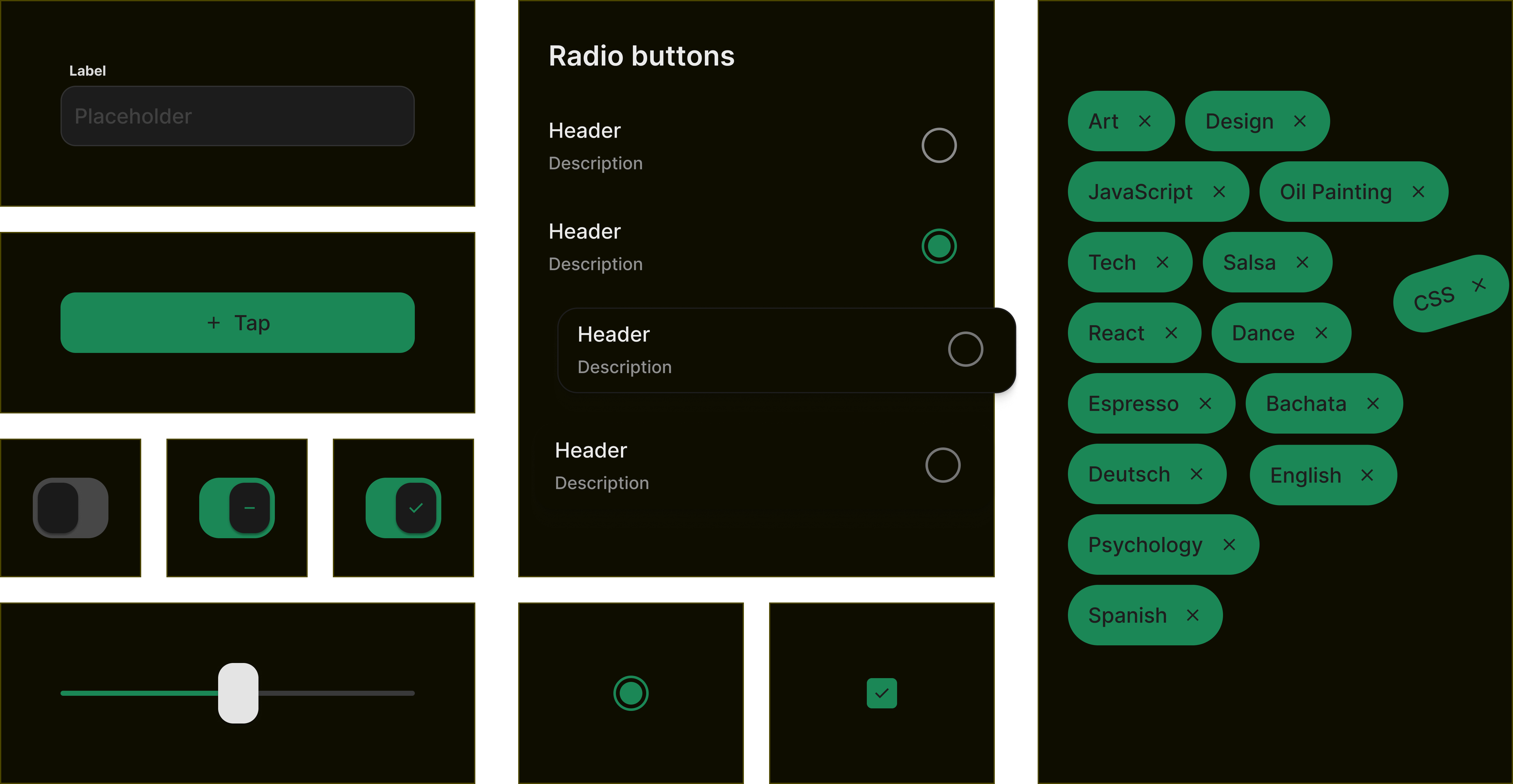
Checkbox

Radio

Chips

Toggle switch

Text input
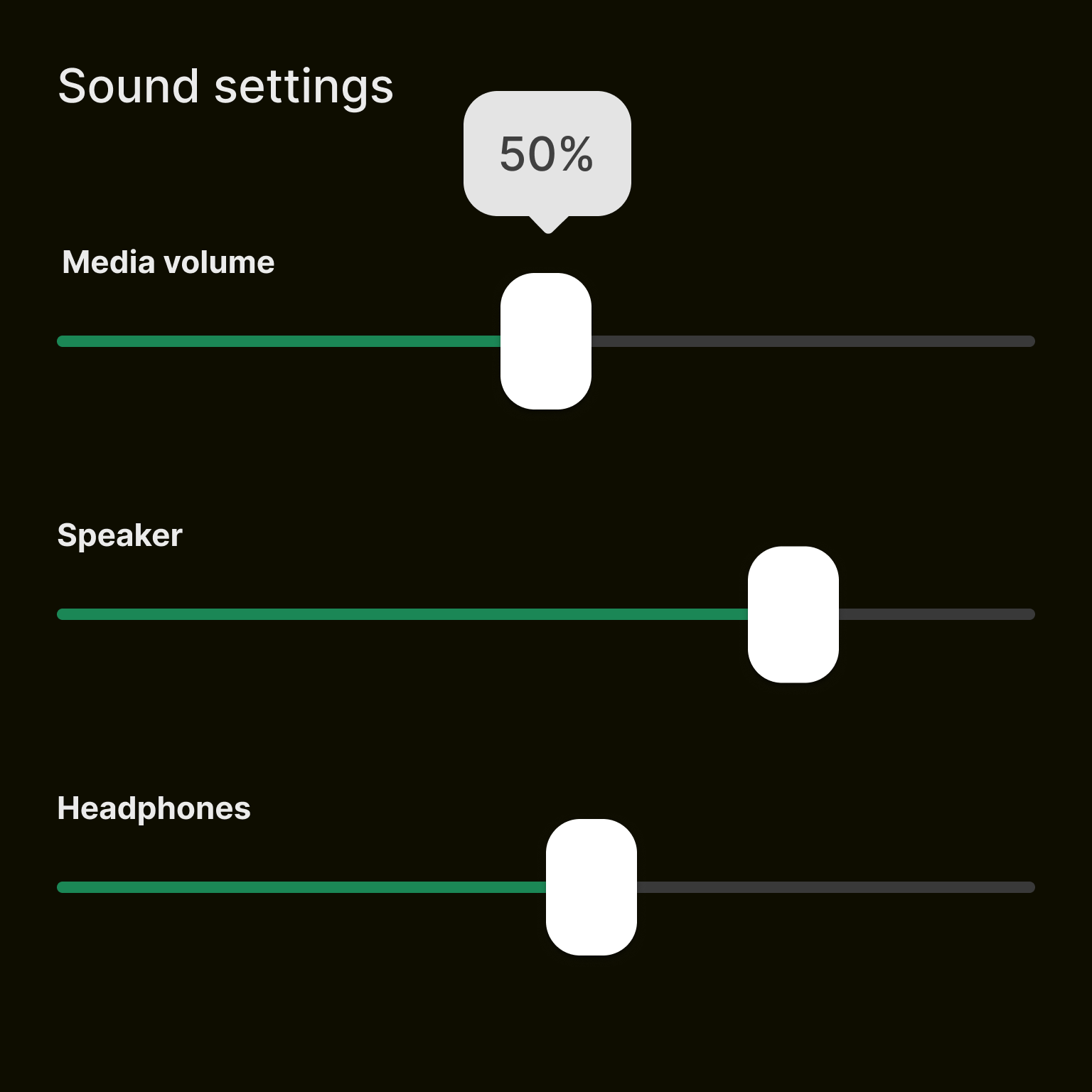
Input range